Making, hacking, breaking, and (sometimes) fixing. Replaced by newer, better, faster nerds.
Posted on - Discuss on Twitter
Tags: Random
I’ve been designing random merchandise/products for various car clubs and social clubs for a fair few years now (closer to 20 now I think about it!) but I haven’t done any new designs in the last year(ish), so I figured I could come up with some new T-shirt/product designs for my local non-profit Hackerspace. They’ve done some basic logo shirt runs before, but the up-front costs of doing “proper” print runs makes it difficult to play around with many designs/styles. Considering I already have an established Redbubble store that’s been going for a few years, I decided to offer to create a category for them there and sell them all at cost-price, just to get shirts on bodies and help spread the branding a bit. With Christmas around the corner I kept it pretty simple and just went with a few basic ideas, but being print-on-demand and no up-front cost for us I could do multiple variations/colours for each idea.
Creating The Designs
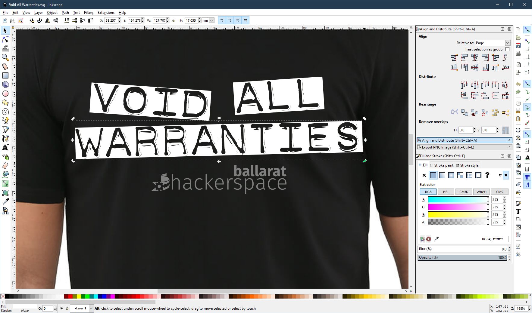
Having cancelled all my Adobe products out of pure rage (and swearing to never touch them again for as long as I live) this was my first real attempt at doing a proper run of T-shirt designs purely in Inkscape. We’re not exactly doing anything super complex here, just some stylised text and basic shapes, so it wasn’t too hard. I’m definitely getting more and more impressed with Inkscape the more I use it. Sure it’s… quirky, but I haven’t really come across anything it can’t do (that I personally need) and I love how fast it is.
I imported a basic stock photo of a black T-shirt just to have some reference/perspective for the final product, and then went about laying down stylised text of the phrases/slogans we came up with. Thankfully the Hackerspace already had a nice vector logo that I could use for their branding side of things, so it was really just an few hours of playing with fonts (my favourite part of every design) and tweaking things until they “clicked” when I looked at them. I’m the brute-force type of designer, I just keep changing stuff around and go through dozens of iterations per design until I’m happy with it.

Once happy with the design, I delete/hide the background T-shirt picture then export the vector design elements as high resolution PNG images, and then import them to Redbubble and start setting up all the products. Redbubble UI/UX is absolutely atrocious, so setting up each product generally takes longer than it took to design the thing in the first place. Tweaking the positioning, scaling, setting each products pricing, metadata, etc etc.
The Resulting Products
The designs/products I ended up liking enough to publish were these below. Each one has links to a page where you can see the design on all the various products I bothered setting up in Redbubble. They do offer a lot more products than this, but they each need the design to be modified/tweaked/etc to suit, so I just went for the main ones that I figured people might like for now. You can also just visit the Ballarat Hackerspace category of my store.
It’s a Hackerspace Not a Perfectospace

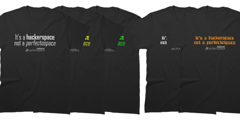
This design comes in a few different fonts/colours but the same slogan that a member Brett came up with: “It’s a Hackerspace, Not a Perfectospace”.
White modern font: https://www.redbubble.com/shop/ap/61724340
Yellow modern font: https://www.redbubble.com/shop/ap/61724994
Green modern font: https://www.redbubble.com/shop/ap/61725166
White 70s font: https://www.redbubble.com/shop/ap/61725403
Orange 70s font: https://www.redbubble.com/shop/ap/61725520
Warranty Voiding

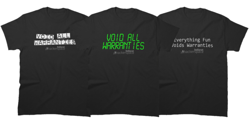
It wouldn’t be a Hackerspace without t-shirts/stickers related to voiding warranties, so here’s my attempts at that.
Void All Warranties in white labeller: https://www.redbubble.com/shop/ap/61728121
Void All Warranties in green LCD: https://www.redbubble.com/shop/ap/61728214
Everything Fun Voids Warranties in plain white: https://www.redbubble.com/shop/ap/61723475

